What Does a CTA Look Like for Home Builders?
The Call to Action (CTA) is one of the most important parts of your website. Without relevant and helpful CTAs that drive your visitors to engage more, they’re likely to just hit the back button after they’ve gotten the information they needed.
That’s not what you want from them.
CTAs are essential in directing a home buyer through each stage of your marketing funnel, moving them forward to the next until they’re ready to talk to sales.
Excluding CTAs out of your marketing means losing out on qualified leads. And if you miss out on these leads, you miss out on revenue.
You want visitors to stay on your site and read more content (which will increase your search engine rankings). You want visitors to download your marketing materials. You want them to pick up the phone and call you, ready to buy your homes.
These things happen through the use of great CTAs.
Reading time: 5 minutes
Level: Intermediate
Skip to the section you’re interested in:
Knowingly or unknowingly, you’ve engaged with CTAs on other websites. So what should the CTA look like for you as a home builder?
It’s all about what your immediate goals are. We break down some of the most likely CTAs that you’ll use.
What is a CTA?
Before we break down types of CTA’s we should first examine what a CTA actually is.
A CTA is a statement designed to have a user perform a desired action. What that action is, well, it depends on the page it's on and what you want your user to do. It could mean downloading a free content offer, subscribing to your newsletter, booking a showhome tour, or requesting to chat with a member of your team.
Say you have a blog on your home builder website showcasing informative articles for your buyer personas - it features your show homes and quick possession homes, but you didn’t include any call to actions.
Now, many people would think it's obvious what the next steps would be after, say, reading about a brand new quick possession home, but what if the reader isn’t ready to build their new home yet? What if they stumbled upon your blog because the title was interesting to them, but there was nothing more there to entice them to stay on your website?
Having an effective CTA on your blog posts can help persuade your site visitors to give you their information so you can start nurturing and marketing to them. It can also drive your readers to a page where they become a conversion — by contacting you for more information, requesting you to contact them, etc.
Effective CTAs can also decrease your bounce rate, which is good for SEO.
Speaking of...
 SEO Importance
Not only is a call to action important for directing your potential buyers to the next steps, but they are helpful in increasing your click-through rate (or CTR). When visitors explore your website by clicking around and viewing pages, it makes your site look more reputable to search engines. The more time a visitor spends on your website, the better, and having an effective CTA can help with this.
 Types of CTAs
There are a few types of different tactics and types of CTAs you can create that can be successful, and this includes the following:
- Action-Packed Text: Instead of “click here” or “submit” use language like “get my free offer” or “I want my guide”. But keep it short - under five words is best practice, and go with first-person speech. Instead of “get your offer” say “get my offer”. This puts a focus on your customers and this type of speech adds to your value proposition.
- Buttons: Download Now, Free Trial, Add to Cart. Try to create a sense of urgency, “Sign Me Up Now” or “Download Today”. Make the colour of your button stand out from the rest of the site. Contrasting colours (like green and orange) work best for this. You can also play with the shape of your button or add effects, just don’t go overboard. You don’t want it to look like ClipArt! And in this case, size matters. Make your text and button large enough to read but not too big that it looks menacing.
- Images: You can get creative with images and add some text to an image call to action. Choose a strong headline that grabs your customers' attention with a sub-headline that has additional text about your offer. Colour is very important here as well. Your entire image can be a completely different colour from your site or just the button on the image can stand out. Doing A/B split testing with an image CTA is a good idea, as you’ll find out which CTAs are enticing more people to click on it.
Let’s dive into some more detail on specific types of CTAs you can try, shall we?
 CTAs For Downloadable Content Offers
Offering some type of free, downloadable offer is a good way to get people to sign up for your mailing list. Once they’re on your list, you can periodically send updates of new blog posts to drive more traffic to your website. You can also let people on your list know about upcoming promotions, which may be enough to move them to the consideration or decision stages of the home buying journey.
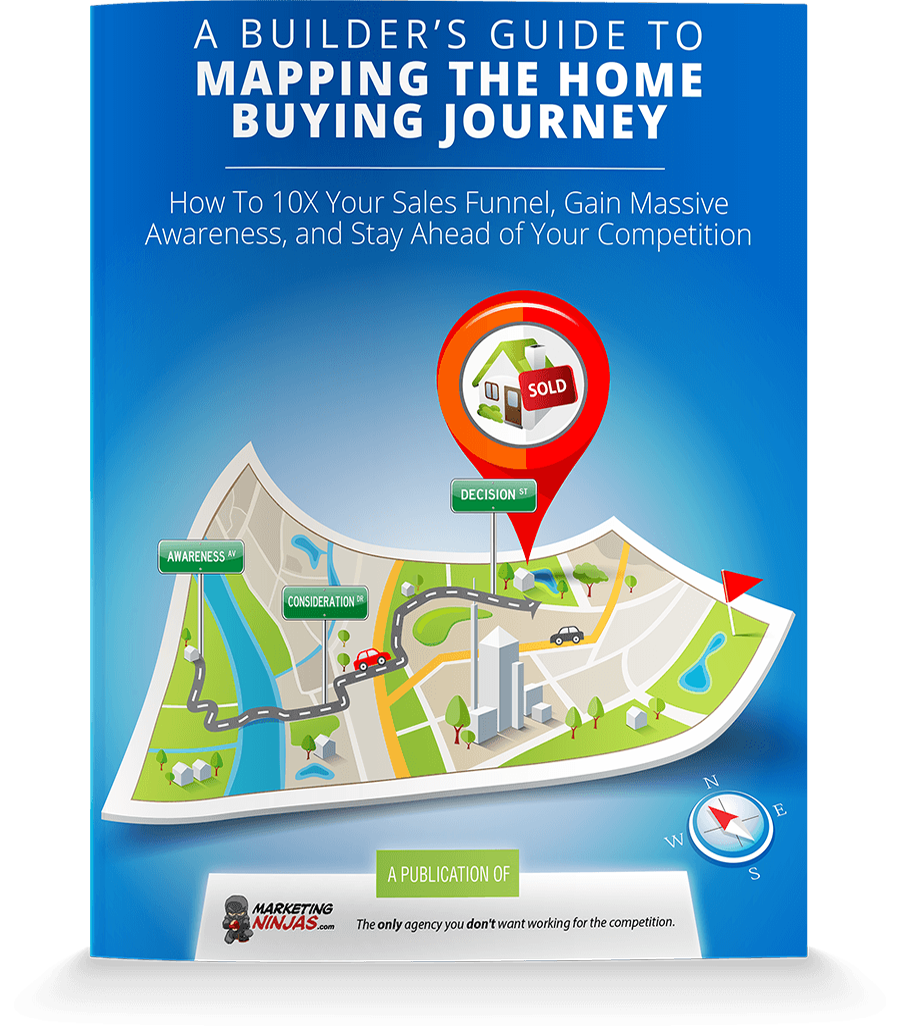
Home builders can attract people with eBooks, guides, handy checklists and white papers - all centered on important topics prospects want to learn more about. You’ll want to have several different downloadable offers to catch your prospects at different stages of their buyer’s journey.
Those who are just starting out and want to explore their options, for instance, would benefit from a guide that has information on how to choose the perfect floor plan. Someone who has already decided they want to build a new home and are researching builders would be more inclined to download a whitepaper that’s specific to what your home building business can offer them.
CTAs That Promote Your High Converting Pages
Let’s say that you have a great blog article or page on your site with a high conversion rate, but it doesn’t attract a lot of traffic from the search engines. You want to get more viewers to see this page because you know it’s another great opportunity for conversion.
One of the best things you can do at this point is attract readers to your website. Try writing a great blog centered around a relevant topic your audience wants to read. Make sure you’re using a keyword that has lots of searches for similar content, too. At the end of that article, you then add a call to action that leads the reader to the high-converting page.
An example of this type of CTA would be finishing your article with “Not sure how to choose the builder that’s right for your family? Read our Top 10 Tips for Choosing a Home Builder”.
 CTAs For Browsing Home Models
Another goal you might have for site visitors is to have them more carefully consider you as their home builder. These are visitors that are closer to the point where they’re going to buy a home, and you want to make sure they choose you. To get closer to this goal, you should be inviting them to browse the home models listed on your site.
To be most effective, your CTA should direct them to model search results that fit their needs. For instance, if you’ve been talking about the features that retirees are looking for in homes, it makes sense to send them to search results for bungalow-style homes.
On the other hand, if the blog post has been about family-friendly features in homes, you’d want to direct them to models that are over 2,000 Square Feet. It’s about matching what you have to their needs so that they see how good your company can be for them.
“Schedule a Tour” CTAs
Serious prospects will want to see more than a few pictures or floor plans. They’ll want to walk the communities they’re looking to build in and check out the quality of your work. So let them! You can do this by suggesting they schedule a tour.
Rather than asking them to talk directly to a sales rep - which can turn some prospects off if done too soon - asking your visitors to schedule a tour is a softer request. They get to see your homes and communities without feeling a lot of sales pressure.
The Call to Action will push site visitors toward making the decision to use your company to build their home. The best CTAs match what the visitor is looking for to what you offer. With a bit of creativity, you can create a CTA that will work for your prospects and send more of them out to tour your showhomes.
At Marketing Ninjas, we have years of experience with CTAs and experimented to find out what works best for home builders. Talk to us today to see how we can help you generate more leads from your website with high-converting CTAs.
Originally published February 12, 2019, updated Sept 29, 2020

