Our Top 3 Tips on Building a High-Converting Landing Page
Want to make the most out of your content marketing efforts and generate more leads for your home building business? One very effective way to accomplish this is through the use of high-converting landing pages.
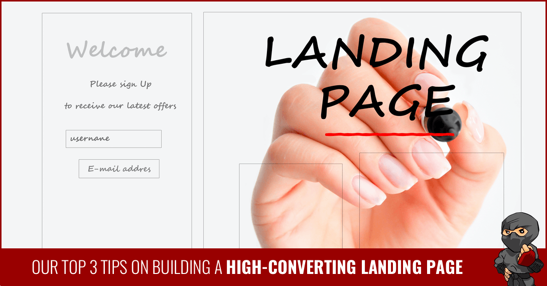
As the name implies, landing pages are the website pages that potential customers “land” on when they search for a specific term or follow a link through your site. The goal of a landing page should be to quickly convert a viewer into a lead by submitting a form.
Reading time: 4 minutes
Level: Expert
Key Takeaways:
- The layout of your landing page matters if you want more conversions
- Think of how you can optimize user experience on your landing pages
- Create valuable and relevant offers that your ideal customers will want to sign up for
This can be trickier than you think.
Consider your own online behaviour. How quick are you to sign up for another company’s mailing list or to download a piece of content? You’re probably pretty guarded about what you sign up for. Maybe you even have a separate email address for ‘spam’. Like most people, you’re really only interested in the things that are relevant and valuable to you.
With our top tips on building a high-converting landing page, you’ll be able to quickly show people what you have to offer and increase your conversions.
You Need The Right Landing Page Structure
There are certain things that all landing pages should have. The two most important elements?
- The headline
- the call-to-action, or CTA.
Headline
Your headline is what grabs the attention of the viewer. It should only be a few words, and it should be in bold, easy-to-read text. A marketing expert can help you with the exact words to use to make your offer stand out, but you usually want to make a statement that intrigues the reader or is posed as a question that they might want answered.
The headline should relate to what you’re offering. For instance, your headline might say, “Avoid These Home-Buying Mistakes” or “Want to Save Money on Your New Home?” Make it clear, to the point and ideally, you want a keyword phrase as well.
 Call To Action
Your CTA is what you’re asking people to do; the action you want them to take. Usually, it’s something along the lines of “Enter your email address below to receive [something the reader wants].”
The CTA section should be eye-catching. You don’t want someone to have to spend a lot of time looking for where they should sign up. Remember, people don’t usually want to give out a lot of information. In most cases, it’s best to ask for as little as possible; only what you need. Ideally, just a name and email address - this will help optimize your conversion rate.
Additionally, many landing pages also have some other information that makes the reader even more interested in signing up. Sometimes, it’s a short piece of writing. Other times, it’s a video that fully explains a product. This really depends on the type of action you want the reader to take.
Your Landing Page Needs To Look Great
Landing page design is important. You have to think about the way the landing page looks.
The best landing pages are uncluttered. You’re designing the page to do one thing: convert viewers into leads. Everything on the page should be aimed at that goal.
Ideally, you want text in a colour that stands out against the background to make it easier to read. You want to remove the usual navigation tools on your site so there’s only one thing that the person can do - convert.
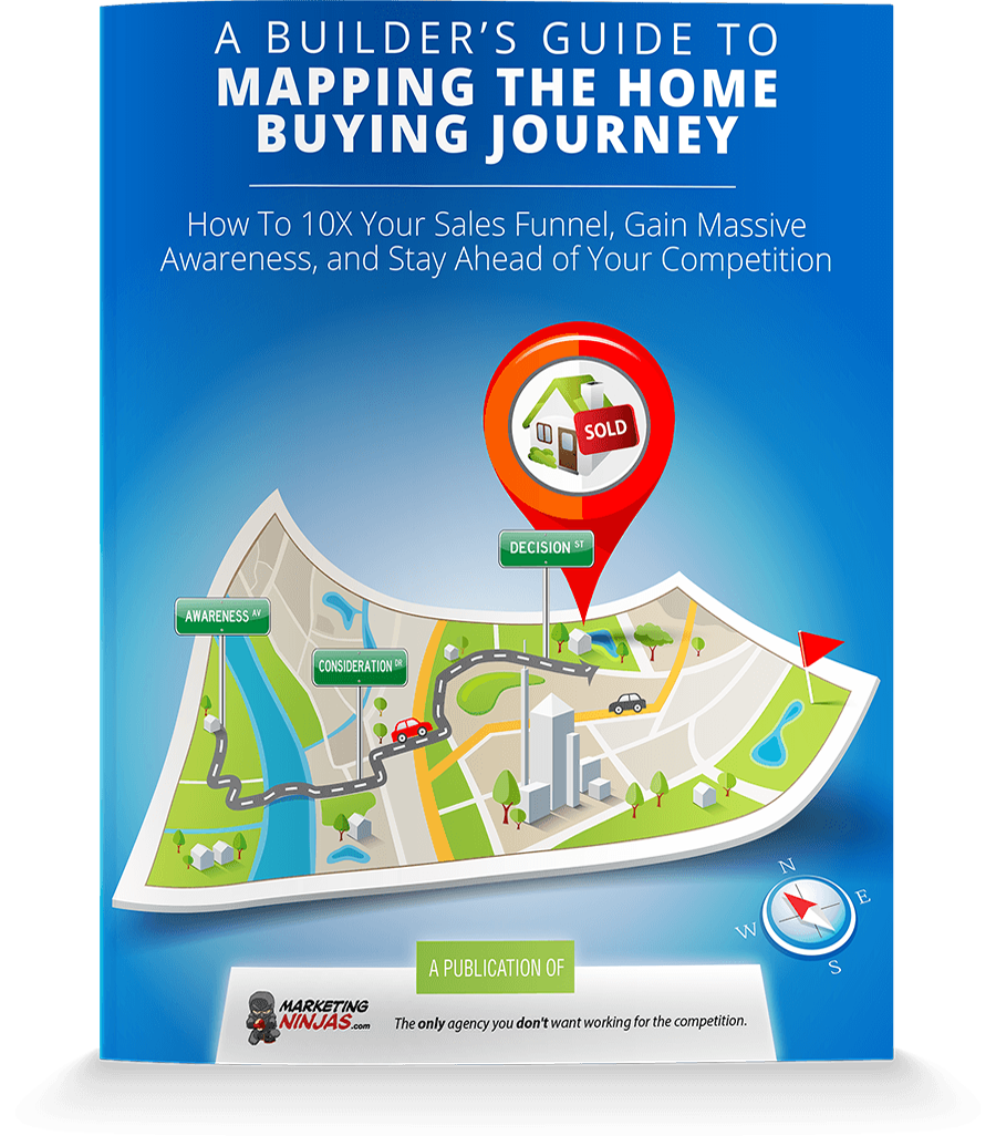
Choose a picture that goes with the offer. As a home builder, you want to use your own home images whenever you can. However, the picture could also be of a family playing in their backyard or of the interior of the home. Whatever the picture is, it should go with what you’re offering. If you have a landing page set up for a particular guide or checklist, you can include a cover or spread image of the guide so when a visitor comes to your landing page, they can see right away what they’re getting when they fill out the form.
Finally, think about the layout of the site. People tend to read top to bottom and left to right. Following this, the headline should be at the top of the page. Your CTA and form are genreally going to be to the right. It’s smart to keep them “above the fold”, which means that viewers shouldn’t have to scroll down to get to the sign-up form.
 You Need Valuable Offers that Speak to Emotions
Think about your home buyer persona(s). What type of content are they searching for? Design helpful resources they can download in exchange for their contact information; resources that help them answer the questions they have.
Home builders who want more conversions and higher quality leads should offer a variety of downloadable content that caters to where your potential clients are in the home buying journey.
For example, someone in the awareness stage might be looking for information on things like down payments or the mortgage process, whereas someone in the consideration stage is likely comparing their floor plan options. Having the content your ideal buyers are looking for will set you up for conversion success because when they visit a landing page, they’re already interested! Selling the form submission is much easier this way.
Alternatively, some viewers are motivated to sign up by the promise of a good deal. This is a good fit for a newsletter sign-up landing page. If you’re telling them that newsletter subscribers are the first to hear about promotions, that is an enticing benefit that could prompt someone to sign up.
Getting your landing page right requires a lot of marketing know-how, and that’s exactly what you get when you work with Marketing Ninjas. Talk to us today to see how we can help you design landing pages that will convert more qualified home builder leads and build up your bottom line.
Originally published Aug 4, 2020

