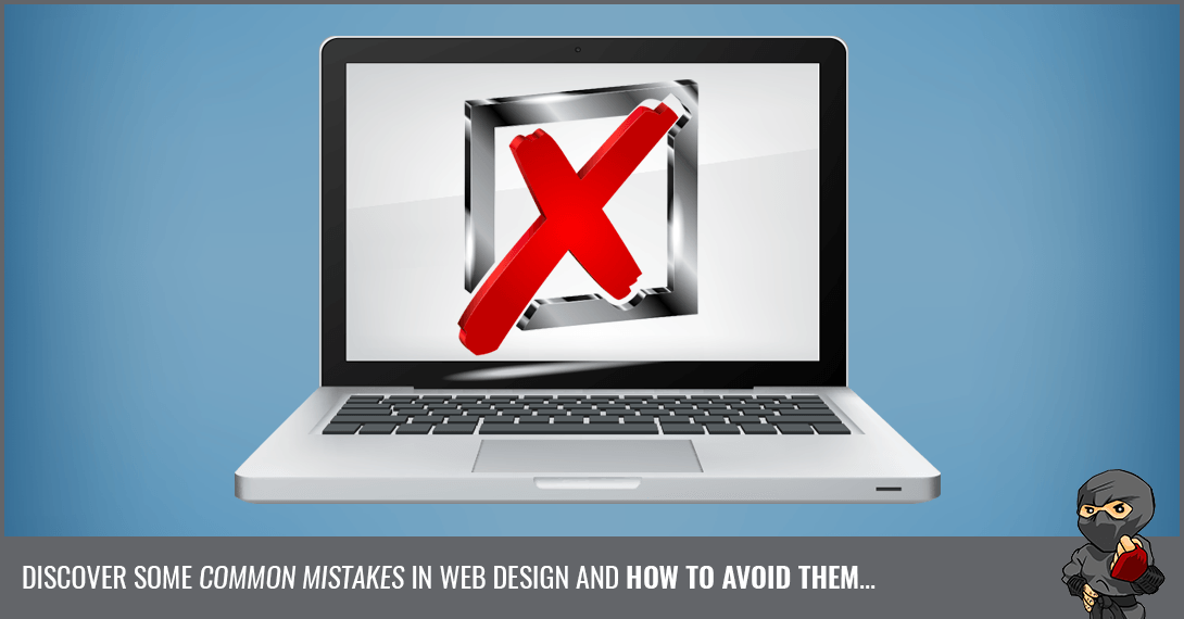


What makes a website good or bad? Is it the appearance? Is it the functionality? What are some common mistakes in web design and how can you avoid them? I will explain what a good website should look like by showing you the top six web design mistakes you'll want to avoid for better user experience.
Read time: 4 minutes
Level: Expert
Skip to the section you're most interested in:

Back in my day…
I think back to the early ’90s when I started in web design. Everything was based in HTML without the ability to code in design mode. So basically, I would write some code and hope that it worked properly when I previewed it. Put a wrong bracket somewhere and your whole page turned wonky. Sites were also built as “frames”.
The top header portion, the middle and sides, as well as the footer where all individual frames that could be scrolled through. It was a hot mess!
But we don’t have to worry about coding websites in this crude way anymore. We’ve come a long way in terms of web design with so many advanced, yet user-friendly, programs and platforms.
 The Good
So what makes a great website? There are a number of design principals that come into play and they include:
-
Clean layout
-
Easy navigation
-
Good colour scheme
-
Proper functionality
-
Organized content
-
Aesthetically appealing
-
Appropriate design related to the industry
Above all else, a good website provides a great user experience. Implementing all the principals above will help to ensure this.
The Bad
There are still so many sites out there that make me cringe. A website is like your brochure - put out there for the whole world to see.
Shouldn’t it make a great first impression?!
From terrible graphics, gaudy fonts, and music playing when you didn’t give it permission, to — wait for it — FRAMES!!! So let’s take a look at how not to make the web a place of cheesy layouts and scroll bars in the middle of the screen…
Unresponsive Design
Having a site that only works properly on a desktop computer is a bad design. 52.2 percent of all website traffic comes from mobile phones. Websites that don’t have a responsive design lose this percentage of traffic. In the past, designers used to design separate mobile websites along with a separate website for viewing on a computer. Those days are (thankfully) gone!
A website with responsive design looks great and works great on any device.
Bad Use of Colour
Another common web design mistake to avoid is the use of conflicting colours. Using a mixed colour palette of bright colours on your background and text makes a site very hard to read. Instead, use elegant colours that are pleasing to the eye and help guide your reader to what you’d like them to view. The only place you should have a bold, stand out colour is on your Call To Action.
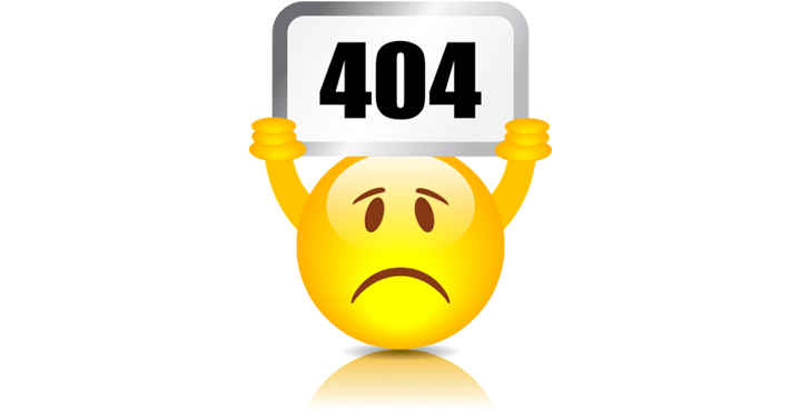 404 Errors
Finding a website with dead links is sure to get anyone frustrated. 404 errors do not give you any bonus points, either with SEO or your readers, so make sure to go through your pages and link them properly. There are many tools available that will crawl through your site and check for these bad links, so please use them.
Bad Nav
Website navigation is the heart of a website and makes the difference in a good or bad user experience. This is why its design shouldn’t be taken lightly. Bad website navigation can make all the content on your site useless for a reader. This can lead to disastrous bounce rates affecting your traffic and how it’s ranked by search engines.
The location of your navigation is very important as well. It must be easy to find and placing it at the top is good practice. A few other problematic nav areas are too many unimportant links, too many hover submenus, and long text labels. This is especially frustrating on mobile since your phone's screen is only so big.
Page Load Time
Ever stumble upon a page with a massive graphic that VERY slowly starts to appear in front of you? No one wants to wait for that! Way back when, I, like many other designers, used to “slice” images into sections for faster loading times, but now we have the ability to compress images so your site can be nice and speedy!
The Ugly
Have you ever gone to a website that actually hurt your eyes to look at? Disorganized images and links randomly scattered all over the page. There’s two seconds of my life I’ll never get back! But seriously, how fast did you want to leave that site? Crazy use of colour and poor typography makes it completely illegible.
The best option for this kind of site would be to use a grid layout, where everything can be organized. Images would align properly and at the same aspect ratio, white space around the image would clearly define it along with the coinciding text, etc.
When you have too many items to showcase, use a grid to organize it!
What Not to Avoid
Your website is your key to attracting buyers to your home building business. A site's design needs to serve the purpose of the website itself. It also needs to take into account aesthetics and functionality.
Do not trust just anyone to design a site for your company. When you’re researching web developers, make sure to do all your homework to avoid bad design mistakes right from the start. If you have any questions, concerns, or need any help along the way, please reach out to us. We're here to help!