![How Colour Affects What We Buy [Infographic]](https://blog.velocity23.com/hubfs/images/blog/Blog_Images/2018/2018-04/colour-affects-what-we-buy-spectrum-featured-image.png)


Every day we are exposed to a wide array of colours, both in nature and the consumer world. The colours that brands use in their logo, on their website, and in advertising are chosen for a reason. Once their target audience is exposed to these visual mediums, the hope is that these colours invoke certain feelings which lead them to a particular action or purchase decision.
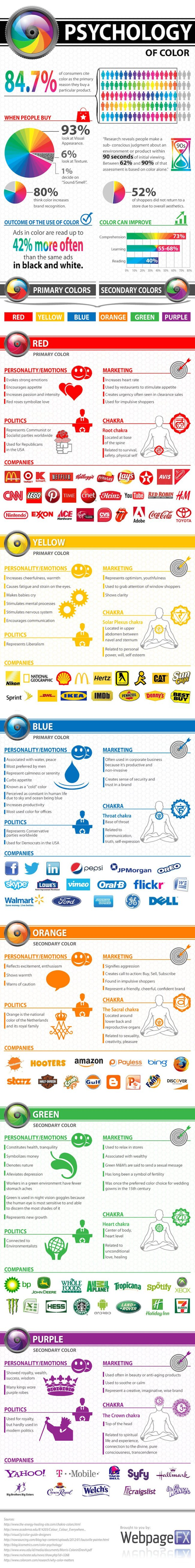
The below infographic from WebpageFX shows exactly how colour affects what we buy as they break down the psychology behind primary and secondary colours.
Psychology 101: How Colour Affects What We Buy
Most of us are blessed with the privilege of sight and use our eyes every day. We're visual beings and find ourselves constantly processing the images from our daily life. This is why companies have focused on aligning the colour they use in their branding and inbound marketing campaigns to match the consumer response they're looking for. We see so many things for very short times, so this use of colour to invoke certain feelings and reactions is an effective method of getting our attention.
These reactions are mostly subconscious and not noticeable enough to detect at the time of viewing unless you're looking at the product itself, but they're present and have a significant influence on the decisions you make. In fact, 84.7% of consumers choose colour as their main reason for buying a particular product.
It's all about the visual experience you get, whether you're looking at a pair of shoes or an email newsletter from your favourite store.
A certain colour has the power to improve the look of a product, increase comprehension of a product or landing page on a website, and is a more appealing text option than black and white. The ultimate goal for businesses is to close the sale with colour persuasion.
The Science Behind Primary and Secondary Colours
Red:
This primary colour is the star in some very famous brand logos. McDonald's, Netflix, The Rolling Stones, and Coca-Cola all have logos with red as the majority or entire colour scheme.
Ironically, the "colour of love" evokes strong emotions like passion and intensity. Exposure to red also increases appetite, which is why fast-food restaurants love to use this colour in their advertising. Brands often use red in their sale signage and flyers to attract impulse buyers. It is also the colour that relates to one's self, survival and overall level of safety.
Yellow:
This cheerful colour is the feature visual behind brands like IKEA, Best Buy, Hertz, Denny's and Pennzoil. While exposure to yellow can increase communication and grab people's attention easily, it can also cause fatigue and hurts the eyes because it's so bright. When used in a more subtle way and in a darker shade, it can help create a positive visual experience for consumers without being a distraction.
Blue:
Two of the world's most popular social media companies in Facebook and Twitter feature this peaceful hue as a major part of their brand recognition. Other widely known companies like Walmart, Ford and American Express also use blue for the majority of their logo.
The colour blue is known to increase productivity, which is why it's no secret that most offices are painted with this colour. On the other side of the company, it creates a sense of security and trust in a brand for customers. Not surprisingly, this is also the colour used by the Democratic Party in the United States.
Orange:
The primary colour orange has been found to exude a warm feeling, one of excitement and enthusiasm. The most notable brands that use this colour in their logos are Hooters, Nickelodeon, Crush, Fanta, and Harley Davidson. Orange is loved by marketers because it represents a friendly and confident brand. It is also a high-converting colour for call-to-action words like Buy, Sell, and Subscribe.
Green:
This is another desirable colour marketers use because it represents wealth and a sense of relaxation. People exposed to this colour are able to distinguish its different shades better than others. It also gives off a feeling of health and tranquillity. Brands like John Deere, Starbucks, Land Rover, and 7-Eleven use green as the main colour scheme for their branding.
Purple:
Back in the medieval ages, many kings wore purple robes. This colour has since been a colour used to represent royalty, wealth, success and wisdom. It is also a soothing and calming colour. This is why purple is a popular colour used in beauty and anti-aging products. Brands that use this violet hue do so because it represents a wise brand that's full of creativity. Some of the most popular brands with purple as their colour of choice include Crown Royal, Welch's, Taco Bell, Hallmark, and Yahoo.
Choose Wisely
The next time your business is looking for a brand redesign or you want to revamp your internet marketing strategy, keep this information on the psychology of colours in mind. It will help you choose the colours that evoke the right emotions and connotations you want your audience to have. With the right formula of colours, you can help close another sale or generate another lead for the funnel. Experiment and see which colour scheme best represents your brand.