Your homepage plays a vital role in the success of your business online.
Typically, it is the one page with the most traffic and it will usually be the one that comes up first in search engine results.
So the question you're probably asking is "what should I put on my homepage"?
This post has what you need to know.
You need to state up front what your website has to offer the visitor. Be clear, to the point and get their attention! One thing to keep in mind, however... You don't want to have just anyone navigating around your site. What you're looking for here is your target market. If the visitor isn't a part of your target, you want them to see right away that your site is not for them so they can go back to the search engines and find a site that would serve them better.
If my site were about weekend underwater basket weaving workshops for teens, I wouldn't want people that aren't into underwater basket weaving on my site. I would make sure to emphasise the key components in my headline. Your sub-headline will help you further by building up your headline.
Your sub-headline needs to back up your headline by giving a brief description of what you do or offer. Make it short, punchy and to the point. From the example above, I would use something like "A fun workshop environment developed for teens by teens".
Remember that the focus of your homepage is to move the visitor down your sales funnel. You will have visitors that are in various stages of the buyer's journey so you want to have a CTA for each of those stages. It's important that these are above the fold on your homepage.
It's amazing to me how many sites still use "cute" or "fun" navigation. You want your visitors to have a clear path on your site which means you want your navigation to be at the top, simple and easy to find what they're looking for. If it's your blog, then call it "blog". And if at all possible, include a search box. You will be surprised at how many people use it.
Well, that's it for the preview... Come on, you didn't think we'd give away all the tips, did you? If you want more you'll have to have to check out the great infographic from HubSpot below!

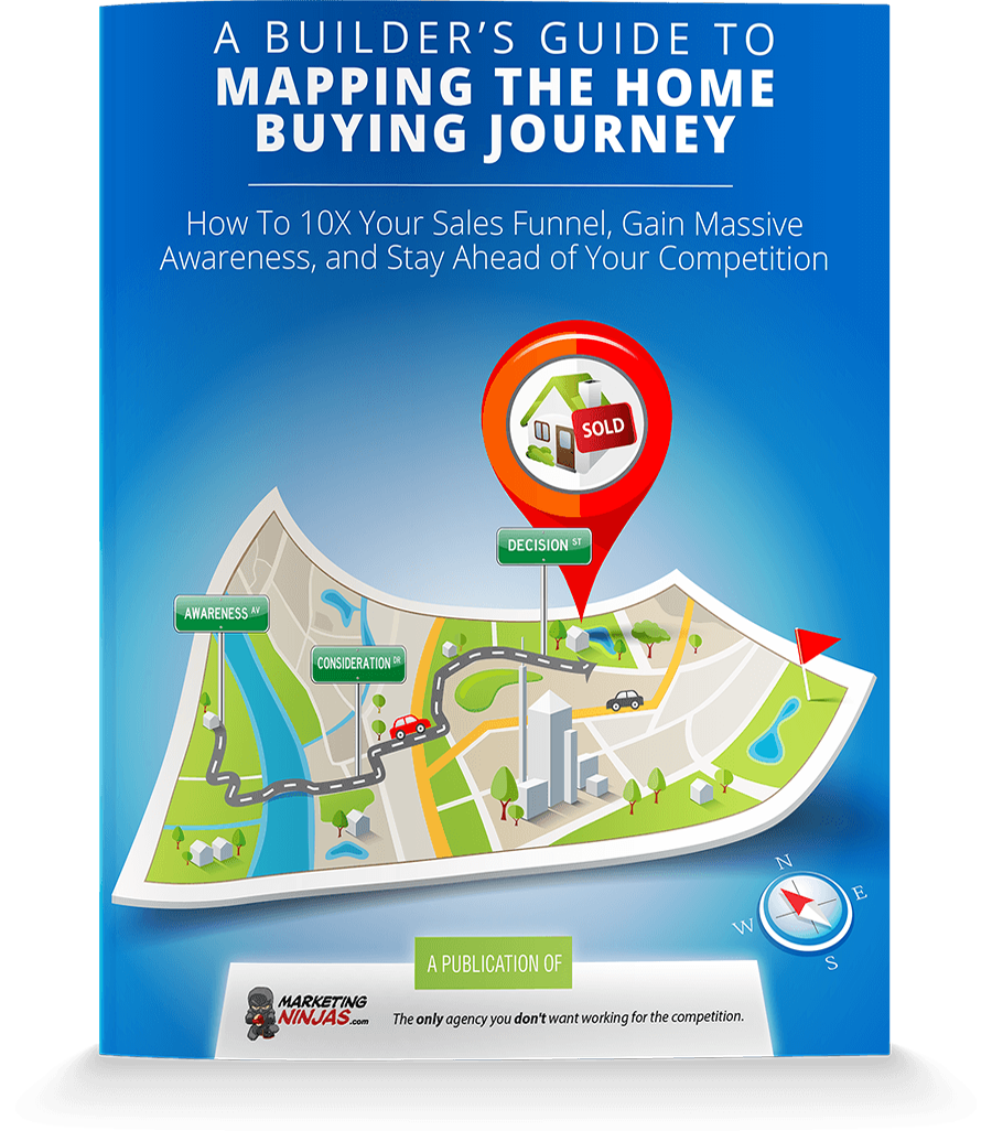
As you can see your homepage has to speak to the different stages of the buyer's journey. Luckily for you, we have created a free ebook that will give you the roadmap you need. We call it Navigating The Buyer's Journey. You can get it by clicking the button on this page.


Wait! Before you go, grab a FREE copy of:
Updated for 2021! Discover how to 10X your sales funnel, gain massive awareness, and stay ahead of your competition. Subscribe to the Velocity23 blog and download your free copy now!
© 2026 Velocity23. All rights reserved.